Email review
Netflix vs. HBO
Two iconic entertainment giants, two completely different email styles — in this review, we compare Netflix and HBO’s approaches to promoting new releases. Which brand offers better usability, accessibility, and design? Let’s find out.
First impression
Both brands aim to draw viewers into their world of shows, but they do so with strikingly different tones and strategies.
Netflix
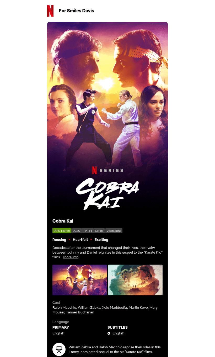
- Netflix goes straight for the heart with Cobra Kai. The full-screen poster-style hero image, emotional descriptors like “Rousing • Heartfelt • Exciting,” and a personalized greeting (“For Smiles Davis”) make the experience feel familiar and relevant.
- The CTA buttons are large, bold, and immediately actionable: “Play,” “My List,” and “Play Trailer.”The overall vibe? Confident, cinematic, and personal.
HBO
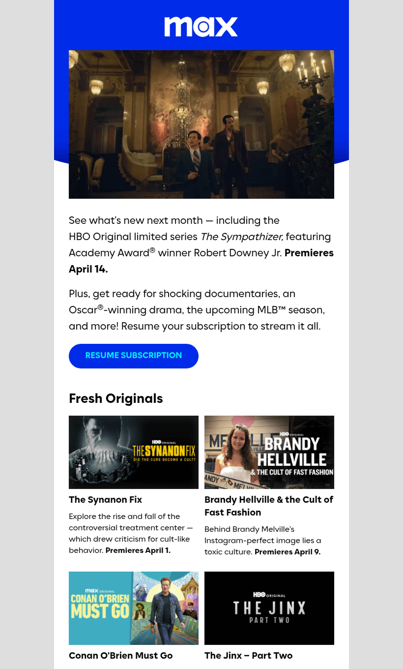
- HBO’s email feels more like a curated press bulletin than a personalized entertainment experience. The animated GIF of The Sympathizer adds motion and drama, but the tone remains formal.
- Instead of focusing on one show, the email promotes a slate of content with premiere dates. It's structured, informative, and content-dense — perfect for a re-engagement push, but less emotionally engaging than Netflix.
Usability
1. Email web version
2. Clickable images
3. “Follow us on socials”
4. Clear CTA buttons
Why are these points important?
1. Email web versions are helpful when images fail to load or when viewing outside typical email clients. Neither brand includes this fallback.
2. Clickable images are vital in media-heavy emails, allowing viewers to intuitively explore shows by tapping on visuals.
3. Social media links are a great bonus for nurturing long-term engagement — HBO includes them; Netflix doesn’t.
4. Clear CTA buttons like “Play” or “Resume Subscription” reduce friction and guide users toward the intended action.
Design
Brand consistency
Netflix delivers its classic black, white, and red palette, consistent with its UI and brand identity. The design is image-heavy with bold typography, just like its streaming platform.
HBO’s layout is clean, modern, and dominated by bright Max-blue. Content blocks and spacing resemble HBO Max’s app interface. The difference? HBO focuses on structure, Netflix on storytelling.
Optimization for dark mode
Both emails perform well visually in dark mode. Netflix’s high-contrast design (black backgrounds and bright red buttons) is naturally suited for it. HBO’s white/gray sections and blue accents remain readable and accessible.
Optimization for mobile devices
Netflix keeps things vertically aligned and tap-friendly — modular, scrollable, and thumb-optimized. HBO follows suit with clean stacking, readable headings, and consistent sizing.
However, HBO’s denser content might make the scroll feel longer on mobile.
Email accessibility
Sans serif font
Text readability
Line spacing 150%
Single-color backgrounds
The “lang” attribute
Alt texts for images
The “role=presentation“ attribute
Email copy
Texts on banners
Netflix opts for a cinematic design in which the show speaks for itself. The hero image does not have a headline—just the Cobra Kai title and genre labels below.
HBO features a headline-driven layout, with a main title (The Sympathizer) and smaller text explaining its relevance.
Buttons
Netflix uses multiple buttons: “Play,” “My List,” and “Play Trailer,” all designed like the Netflix app.
HBO only includes one primary CTA: “Resume Subscription.” It’s effective for its purpose, but leaves little room for show-level interaction.
Overall copy
Netflix delivers emotion through visuals and short, impactful blurbs (e.g., “Heartfelt • Rousing • Exciting”).
HBO provides highly informative copy, with premiere dates, summaries, and even award mentions. It’s practical, but it reads more like a content catalog than an entertainment teaser.
Legal requirements
Physical postal address
Unsubscribe option
Reason for receiving a message
Each brand plays to its strengths — one evokes feeling, the other provides function. Depending on your campaign goal, there’s inspiration to take from both.


