Email review
Pulp & Press vs. Bulldog Skincare
Two brands, two different approaches—today, whether it's skincare or healthy juices, these brands aim to show concern for well-being. Let’s explore how Bulldog Skincare and Pulp & Press design their emails to engage subscribers.
First impression
Pulp & Press
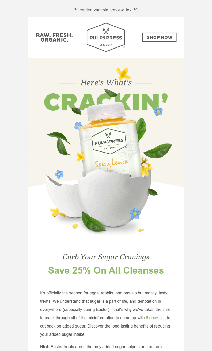
- The subject line "Hey there, hop stuff. 🐰🥕" sets a fun, seasonal tone.
- The Pulp & Press logo and tagline ("RAW. FRESH. ORGANIC.") appear at the top, making branding instantly recognizable.
- The main visual (a cracked egg) reinforces the Easter theme and connects to the messaging.
- The 25% discount offer is emphasized in large, green text.
Bulldog Skincare
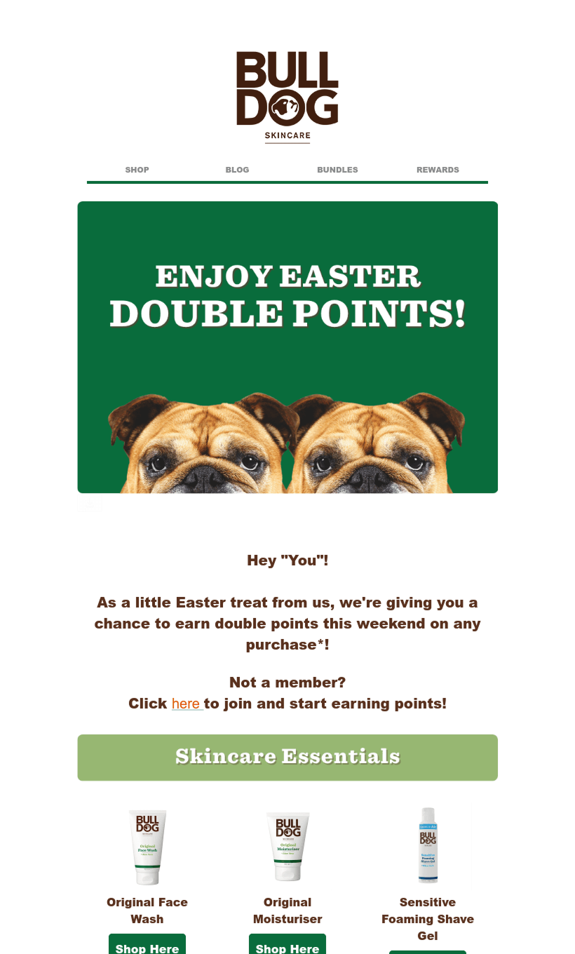
- The email opens with a bold green banner featuring large, white uppercase text: "Enjoy Easter Double Points!".
- The Bulldog Skincare logo is prominently placed at the top, reinforcing brand identity.
- The tone is playful and friendly, addressing the recipient as "Hey 'You'!".
- Key offer (double points on purchases) is clearly stated and visually highlighted.
Usability
Email web version
Clickable images
“Follow us on socials” section
Clickable buttons for website links
Why are these points important?
Web Version: Ensures accessibility if the email doesn’t display correctly or images don’t load.
Clickable Images: Increases user engagement by allowing interaction beyond just buttons.
Social Media Section: Encourages brand engagement across different platforms.
Website Links: Directs users to shop, learn more, or use discount codes efficiently.
Design
Brand consistency
Bulldog Skincare uses earthy green and brown tones, reinforcing its natural skincare identity.
Pulp & Press opts for a clean, minimalist palette with light green, beige, and white, aligning with its organic, health-focused branding.
Bulldog Skincare sticks to bold, uppercase fonts for key messages.
Pulp & Press plays with typography size variations (e.g., large “CRACKIN’” text) to create emphasis.
Optimization for dark mode
Bulldog Skincare may experience contrast issues in dark mode due to its green and brown tones.
Pulp & Press has light text on white backgrounds, which may not display well in dark mode.
Optimization for mobile devices
Both emails are well-structured for mobile screens.
Bulldog Skincare’s stacked sections make scrolling smooth.
Pulp & Press uses white space effectively, making the content easy to read on small screens.
Email accessibility
Sans serif font
Text readability
Line spacing 150%
Single color backgrounds
The “lang” attribute
Alt texts for images
The “role=presentation“ attribute
Email copy
Texts on banners
Bulldog Skincare: Simple, direct promo message ("Enjoy Easter Double Points!").
Pulp & Press: Playful and engaging (“Here’s What’s CRACKIN’”).
Buttons
Bulldog Skincare: Uses “Shop Here” buttons for each product.
Pulp & Press: Uses “SHOP NOW” for CTAs and “LEARN MORE” to provide additional information.
Overall copy
Bulldog Skincare: Keeps text minimal and focused on the loyalty program.
Pulp & Press: Provides more detailed messaging about the benefits of reducing sugar intake alongside the promo.
Legal requirements
Different countries have different email compliance laws, such as the CAN-SPAM Act in the USA or the General Data Protection Regulation in Europe. Adhering to these regulations is crucial in order to avoid any legal consequences and maintain a good reputation. Let's explore how today’s guests are managing to remain compliant with these requirements.
Physical postal address
Unsubscribe option
Reason for receiving a message


